glass
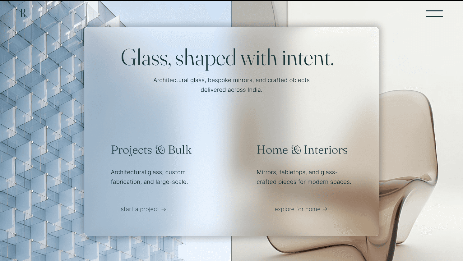
A premium glass solutions platform serving both commercial clients and homeowners. The goal was to create two tailored experiences from a shared entry point, allowing each audience to quickly access the information most relevant to their needs while maintaining a consistent brand experience.
2026
1 week

The Challenge
Commercial buyers and homeowners visit the same website with entirely different goals.
Commercial clients evaluate technical capability and project delivery, while residential customers seek inspiration, products, and customization. Combining both into a single journey creates unnecessary friction for everyone.
Different user intentions
Different decision-making processes
Shared brand identity
One digital experience
How might we serve two audiences without making either feel secondary?
Experience Strategy
Instead of building two separate websites, I designed one shared entry point that branches into two tailored experiences.
Dedicated B2B and B2C journeys
Shared visual language
Consistent navigation patterns
Faster access to relevant content
Journey Design
Commercial Experience
The commercial journey prioritizes confidence, capability, and project information before conversion.
Project-first navigation
Service capabilities
Process transparency
Trust-building throughout the journey
Residential Experience
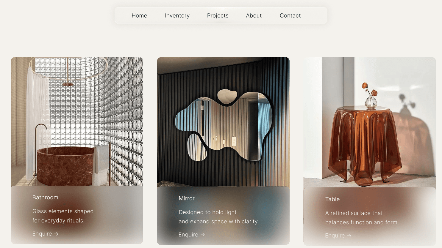
The residential journey focuses on exploration before enquiry, helping users discover products through curated spaces and collections.
Lifestyle-driven browsing
Product collections
Space-based inspiration
Simple enquiry flow
Design Decisions
1. Intent-Based Navigation
The homepage separates visitors based on intent instead of forcing everyone through the same navigation.
Dedicated entry paths
Reduced unnecessary navigation
Faster access to relevant content
Clear decision-making from the first interaction
2. Glass as a Material Language
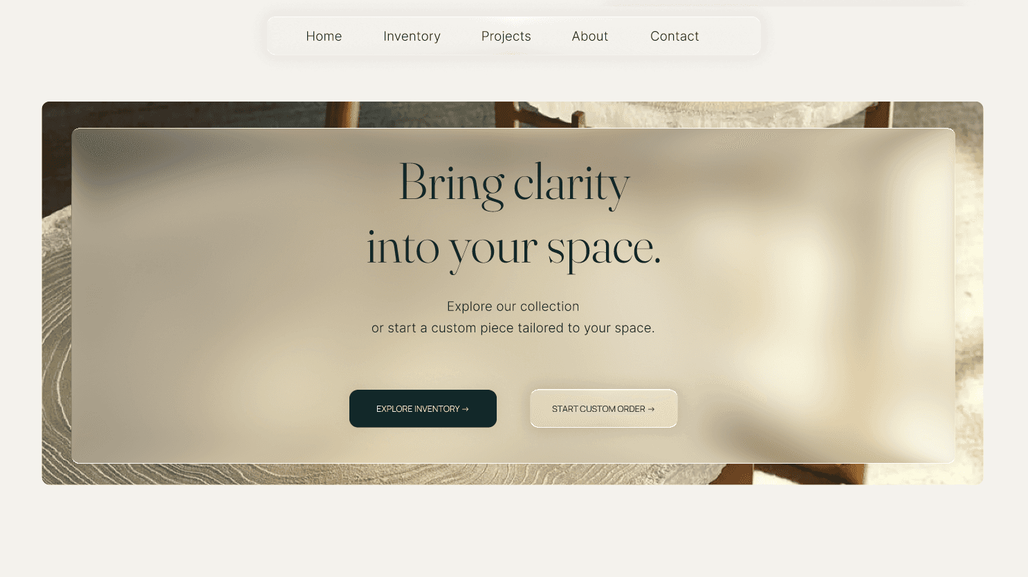
Rather than using glassmorphism as decoration, it became part of the product identity.
Frosted interface panels
Layered depth
Soft transparency
Subtle motion and lighting
The interface reflects the material the business works with while keeping content readable.
3. Building Trust Before Conversion
Rather than leading with enquiry forms, both journeys establish credibility first.
Featured projects
Process transparency
Product craftsmanship
Client testimonials
Every section answers common questions before asking users to take action.
4. One Design System, Two Experiences
Although both journeys serve different audiences, they share a consistent component system.
Reusable layouts
Shared interaction patterns
Consistent typography
Modular content sections
This keeps the experience cohesive while supporting future expansion.
Design Trade-offs
Designing for two audiences required balancing different priorities without making either experience feel secondary.
Rather than creating feature-heavy navigation, the experience prioritizes clear entry points and progressive disclosure, allowing each audience to reach relevant content with fewer decisions.
Outcome
The redesign creates a clearer path for both commercial and residential users while maintaining one consistent brand experience.
Audience-specific user journeys
Reduced navigation complexity
Unified design system
Trust-focused information architecture
Designed and prototyped within one week as part of a fast-paced agency workflow.
