prime
Prime Hydration is a youth-driven beverage brand built around creator culture and Gen Z audiences. This redesign explores how motion, bold visuals, and flavor-driven storytelling can create a more engaging shopping experience without sacrificing usability.
2024
3 weeks

The Challenge
Prime's products feel energetic and memorable, but its digital experience has room to better reflect that identity.
The goal was to create an immersive shopping experience that matched the brand's personality while keeping purchasing simple and intuitive.
Preserve purchase clarity
Increase brand immersion
Encourage product exploration
Maintain a scalable experience
How might we design an experience that feels as energetic as the product itself?
Audience Strategy
Rather than designing for everyone, the experience was built around Prime's core audience.
Primary Audience
16–28-year-old Gen Z consumers
Design Principles
Emotion-driven browsing
Bold visual hierarchy
Motion as feedback
Fast, exploratory interactions
Every design decision prioritized engagement without disrupting the shopping journey.
Design Direction
The visual language amplifies the product rather than competing with it.
High-contrast black interface
Flavor-driven color environments
Bold typography
Cinematic layouts with strong visual focus
The result is a system where each flavor feels distinct while remaining recognizably Prime.
Experience Decisions
1. Motion That Guides
Motion was designed to improve flow rather than simply add animation.
Smooth page transitions
Smart Animate product movement
Fluid quantity interactions
Seamless navigation between product states
Every interaction supports exploration while maintaining momentum.
2. Flavor-Driven Storytelling
HYDRATION
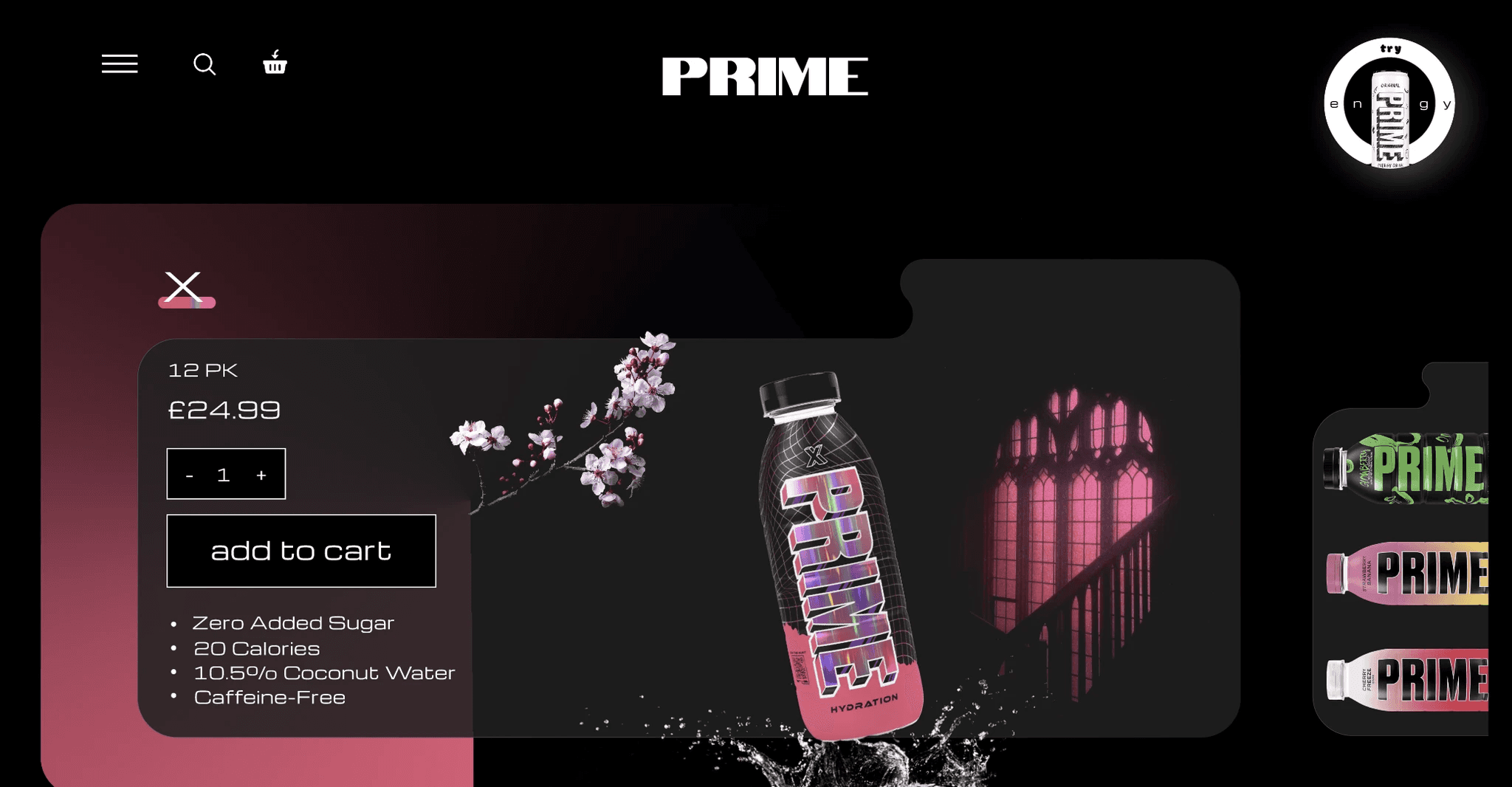
ENERGY
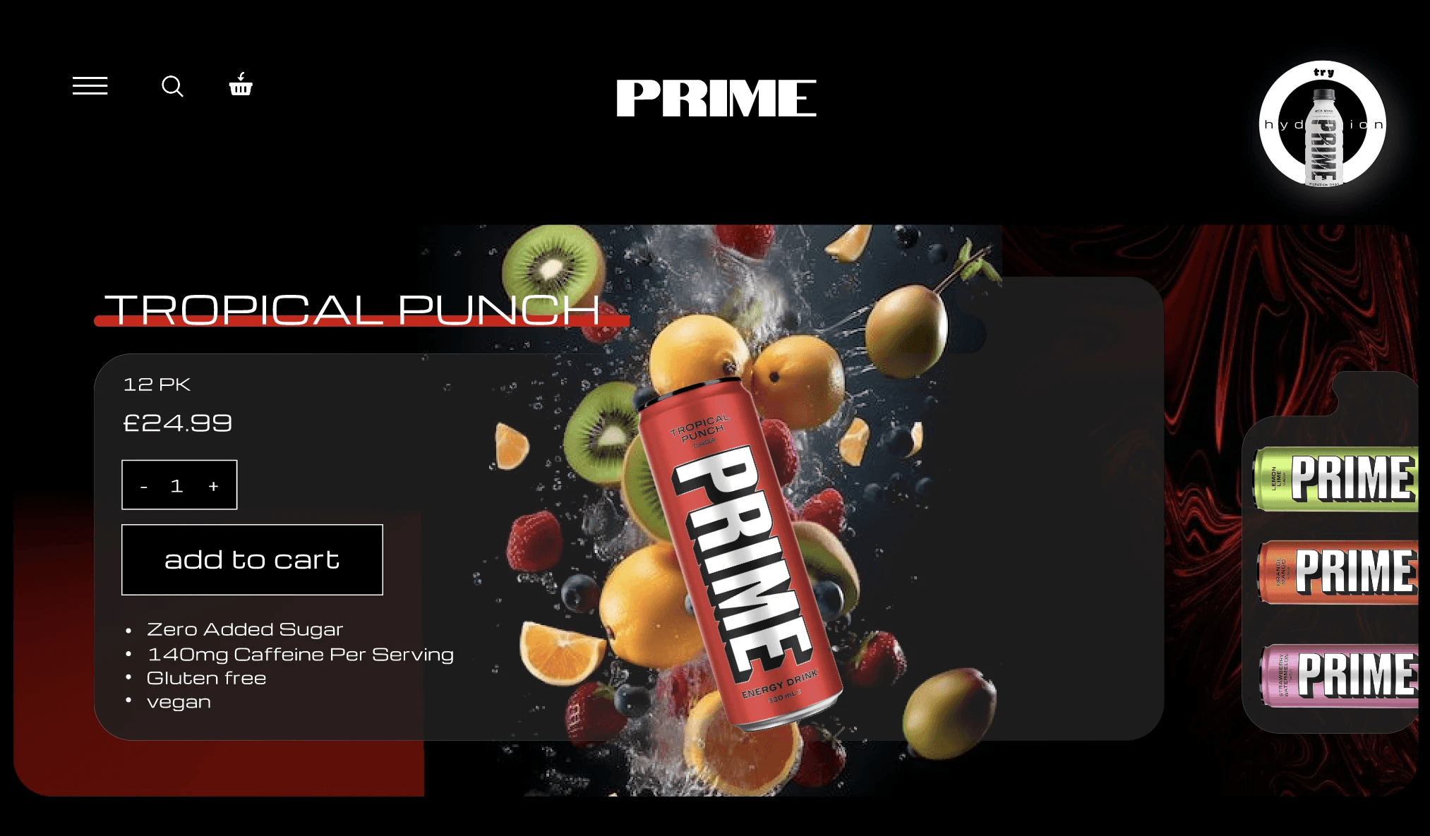
Each flavor was treated as its own visual experience instead of simply changing product colors.
Unique color environments
Stronger product personality
Increased memorability
Encourages browsing across variants
3. Designed for Exploration
The browsing experience encourages users to discover products before making a purchase.
Large product visuals
Clear product hierarchy
Focused call-to-actions
Consistent purchase flow
4. A Scalable Visual System
Rather than designing individual pages, I built a reusable system that could scale with future product releases.
Modular layouts
Consistent interaction patterns
Reusable product sections
Adaptable color themes for every flavor
Balancing Brand & Usability
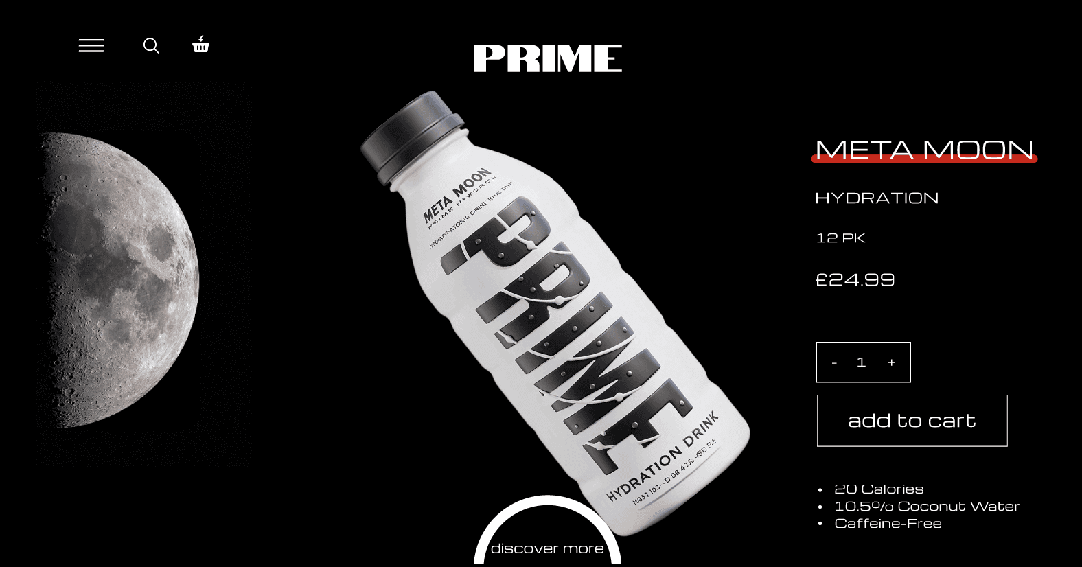
While the experience embraces bold visuals and motion, core purchasing interactions remain simple.
Key UX priorities included:
Clear pricing visibility
Prominent Add to Cart actions
Simple quantity controls
Consistent layouts across products
The goal was to make the experience feel exciting without increasing cognitive load.
Outcome
This redesign explores how stronger brand expression can elevate a digital shopping experience.
Motion-first interaction design
Flavor-driven visual storytelling
Scalable design system
Audience-focused UX decisions
The project demonstrates how branding, interaction, and usability can work together to create a memorable e-commerce experience.
