real estate
Buying or selling property is a high-stakes decision. This redesign explores how a structured interface can reduce cognitive overload, build trust, and help users navigate the process with confidence.
2025
ongoing

The Challenge
Many real estate platforms overwhelm users with information before helping them make decisions.
Common pain points included:
Too many listings at once
Competing calls-to-action
Complex filtering systems
Weak separation between buying and selling
This often leads to decision fatigue and reduced confidence during high-value transactions.
How might we simplify the property journey without oversimplifying the experience?
Design Strategy
Every design decision focused on reducing cognitive load while maintaining trust and professionalism.
Prioritized clarity over density
Reduced unnecessary visual noise
Guided users through structured journeys
Balanced simplicity with essential information
Trust-First Experience
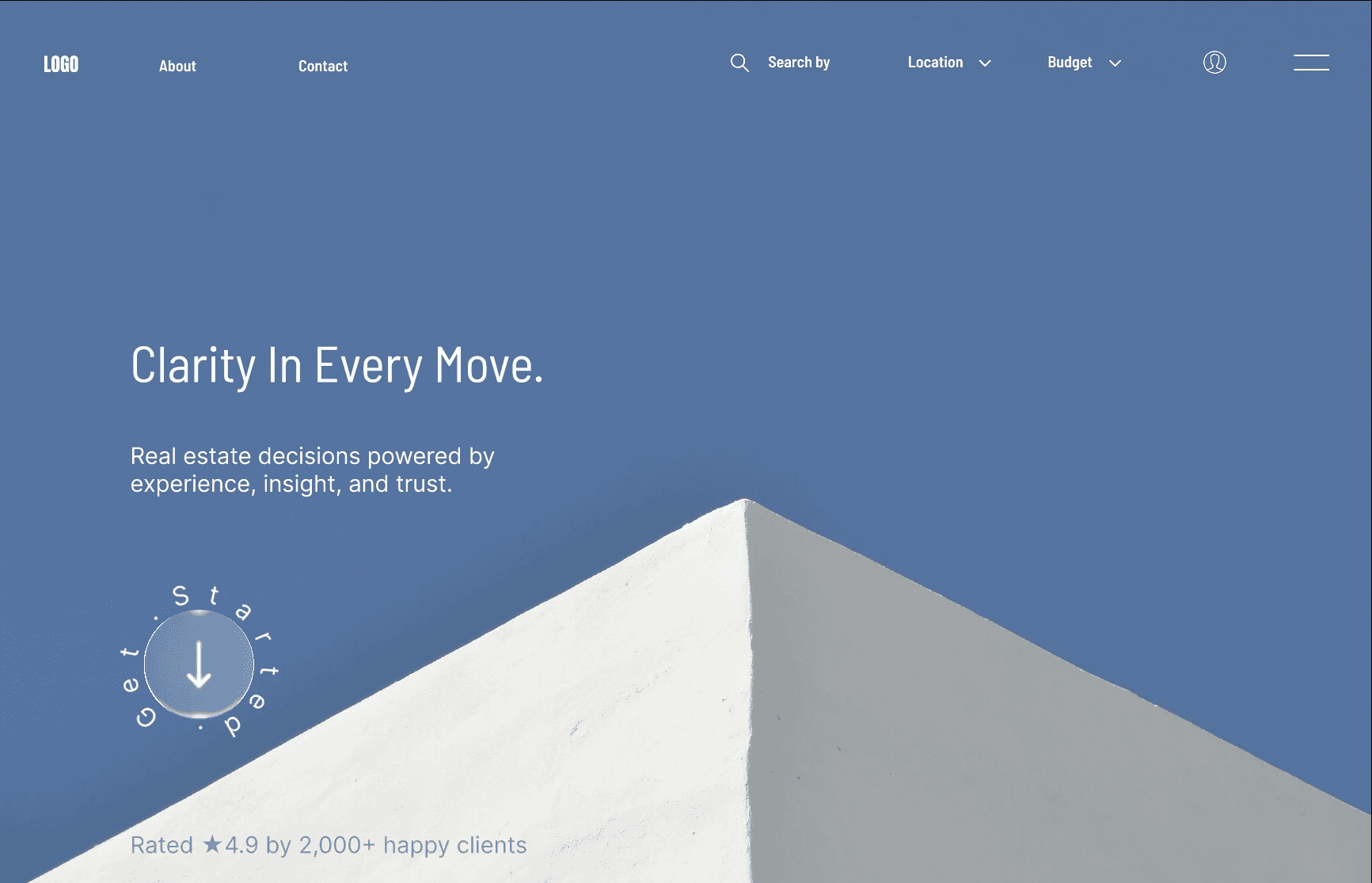
The landing experience establishes credibility before introducing complexity.
Minimal typography
Calm visual language
Strong architectural imagery
Social proof positioned early
Rather than presenting dozens of listings immediately, the homepage first builds confidence.
Experience Decisions
1. Reducing Cognitive Load
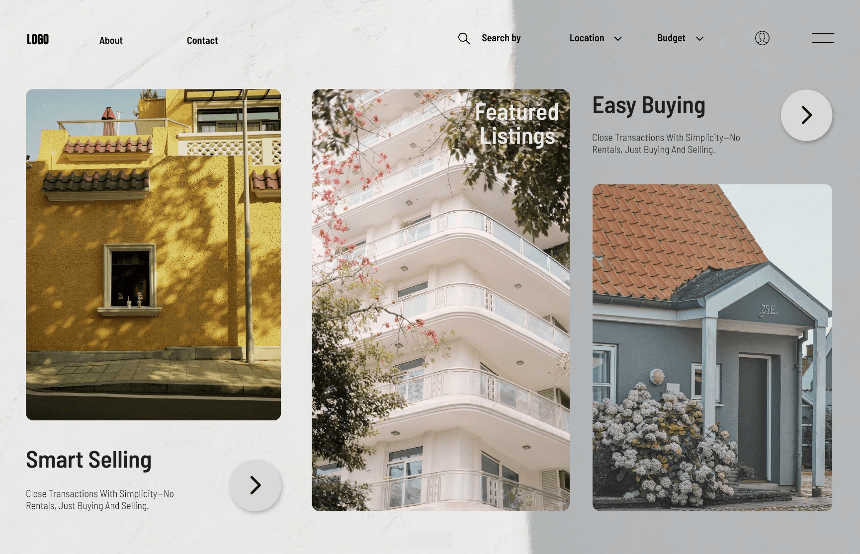
Instead of overwhelming users with property choices, the homepage introduces information progressively.
Featured properties first
Clear categorization
Generous whitespace
Strong visual grouping
2. Guided Property Discovery
Property listings were designed to improve scanability and comparison.
Large image-focused cards
Minimal supporting text
Clear information hierarchy
Consistent browsing patterns
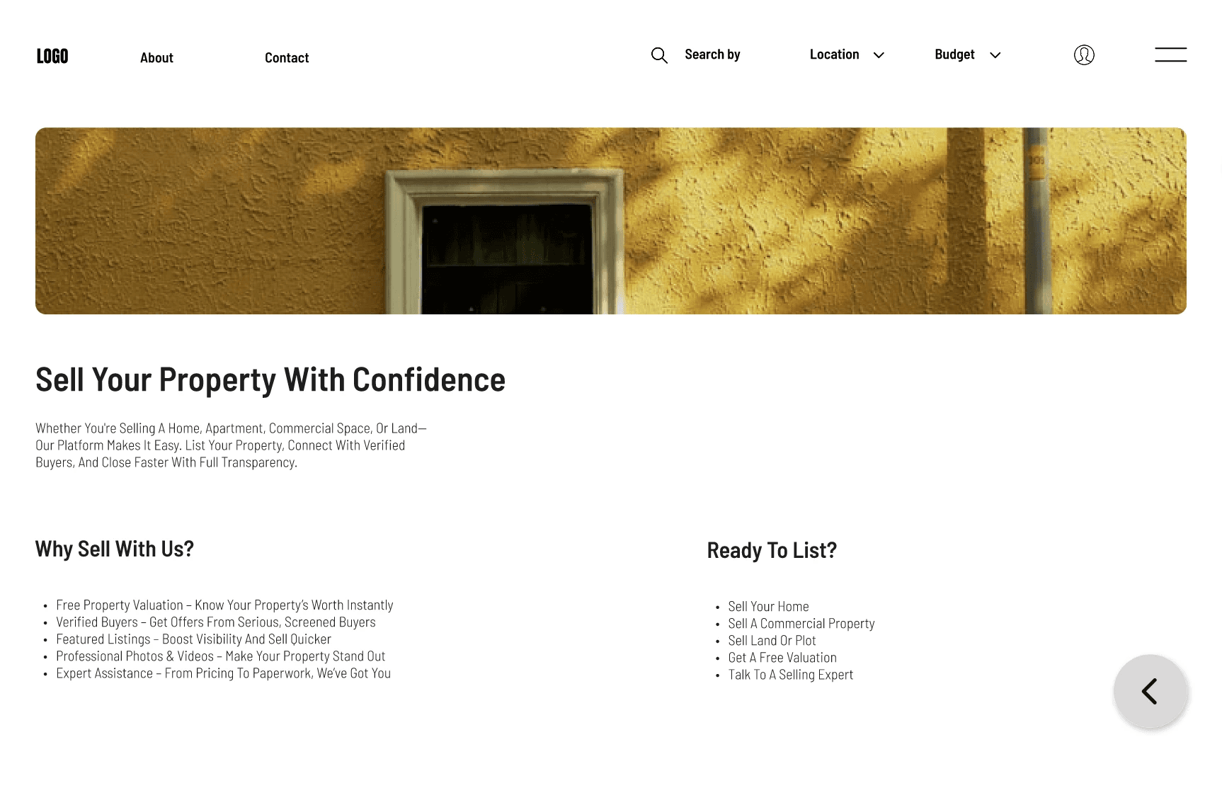
3. A Dedicated Selling Journey
Selling was treated as an equal journey rather than a secondary feature.
Step-by-step structure
Clear value propositions
Reduced form complexity
Transparent information hierarchy
The experience focuses on building confidence before requesting user input.
4. Visual Language That Builds Trust
The interface was intentionally designed to feel calm, professional, and reliable.
Neutral backgrounds
Balanced typography
Soft elevation
Controlled accent colors
Consistent spacing
Every visual decision supports readability over decoration.
Designing for Clarity
The experience applies core UX principles to simplify decision-making throughout the platform.
Progressive disclosure
Strong visual hierarchy
Reduced CTA competition
Clear separation between buying and selling
Consistent interaction patterns
Design Trade-offs
Real estate platforms require a large amount of information, but presenting everything at once increases cognitive load.
This project prioritizes clarity over feature density, accepting fewer on-screen options in exchange for better navigation and stronger decision confidence.
Outcome
This redesign demonstrates how thoughtful information architecture can improve high-stakes digital experiences.
Reduced cognitive load
Clear journey separation
Trust-focused visual design
Structured marketplace experience
The project strengthened my understanding of designing products where clarity has a direct impact on user confidence.
